Unquo
Throughout my time at SEBx I have worked with the entire range of mobile product design, spanning from user research to strategy, UX design and visual design.
The majority of my time at SEB I have worked extensively with UX strategy. I led a change to a data and user driven approach. I transformed notes from over 200 interviews to insights that help drive the product forward. Now decisions are made based on usage patterns in the app and user research, business needs taken into account of course.
I have pushed for technology changes needed to support rapid iterations of smart financial services. I have led, designed and released several major features in the app, worked on modularisation and information hierarchy of the entire app, navigation patterns, UX principles and strategic concept development. I have built a scalable atomic design system taking into account best practices for iOS and Android.
App modularisation and navigation patterns
When I started at SEBx, UNQUO was suffering from growing pains. A lot of different people had been previously involved, which resulted in features being added a bit all over the place with different navigation patterns, inconsistencies and no room to expand the growing feature set in a sustainable way. In an effort to resolve this I led the work on creating a current state sitemap, looked at all screens and components that were used, and later created a more coherent strategy when it comes to navigation patterns and how the app could grow. I pitched the concept of modularisation and redesigned the entire app for the future as well as set the information hierarchy and what components and modules to place where on each screen.
Transactions
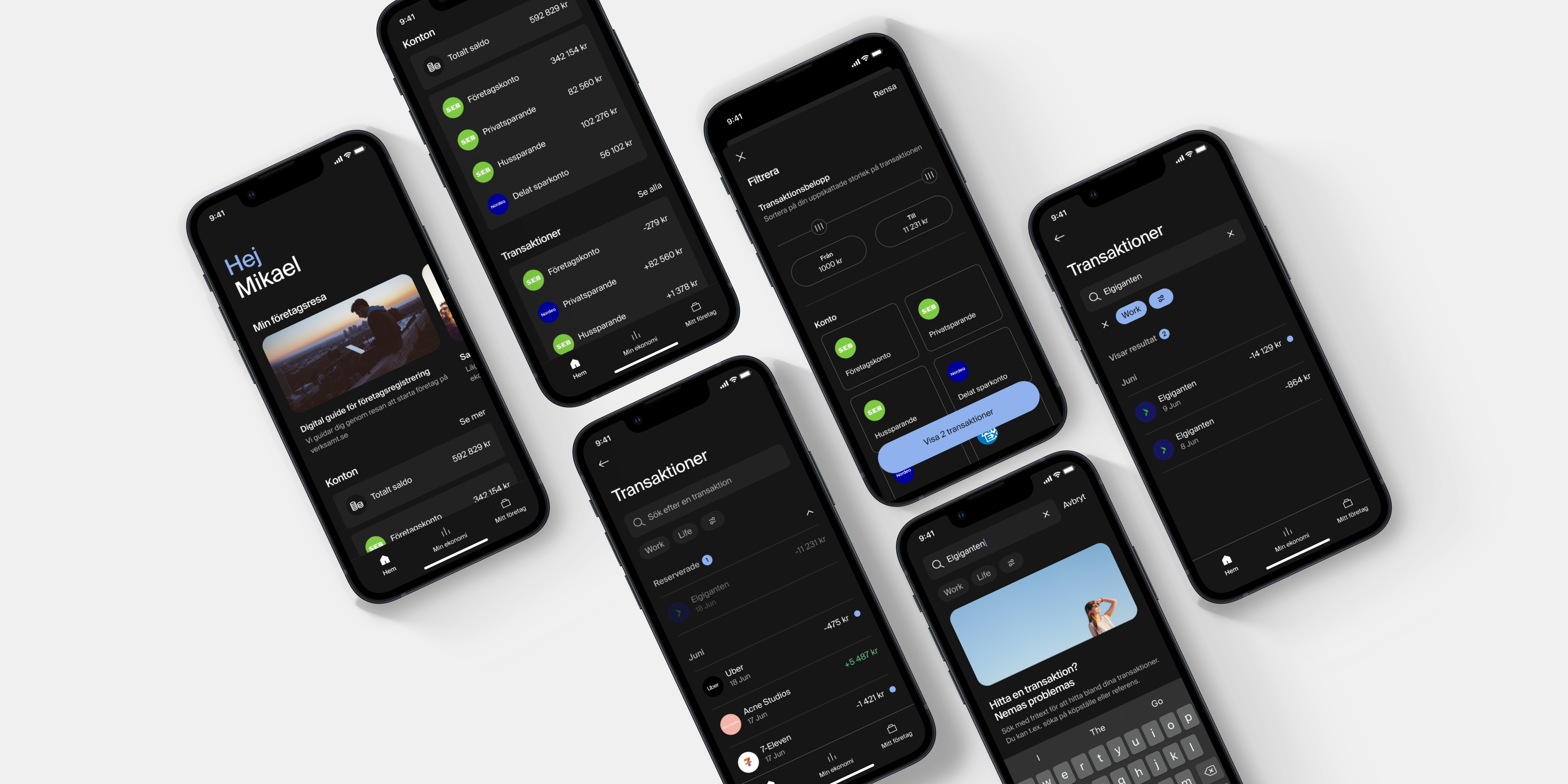
In an effort to modularise the app and improve on the experience of viewing and working with transactions in the app, I moved the transaction list away from the home screen and into a separate page where the users full attention could be directed towards working only with the transaction list. As a key feature of the app is to add various enrichments (such as notes, receipts for bookkeeping and categories) to transactions I designed a search function and other fast ways of adding enrichments where they are needed - users mainly need to add information to business related transactions. The flow in the image and video shows the transaction list entered from the home screen, and the process of applying search terms and filters to find specific transactions.
Transaction details
The flow in the image and video shows an example of transaction details, and how the user adds categories, tags, receipts and notes. When a user adds enrichments to transactions it feeds graphs that help the user’s understand their finances, and simplifies future bookkeeping. One of the largest pain points of users is to get an overview over their finances, and this is designed to help with that.
Accounts
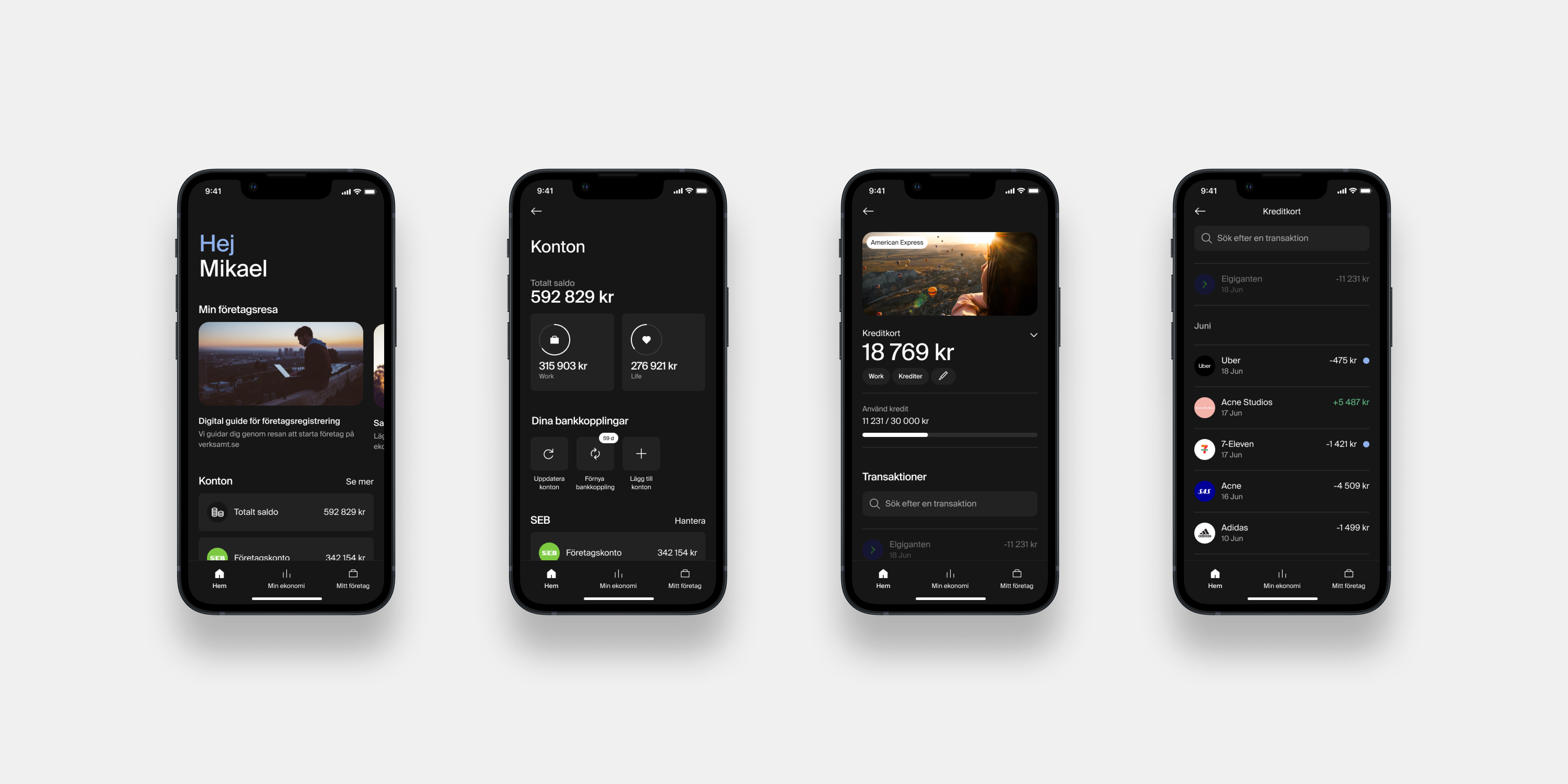
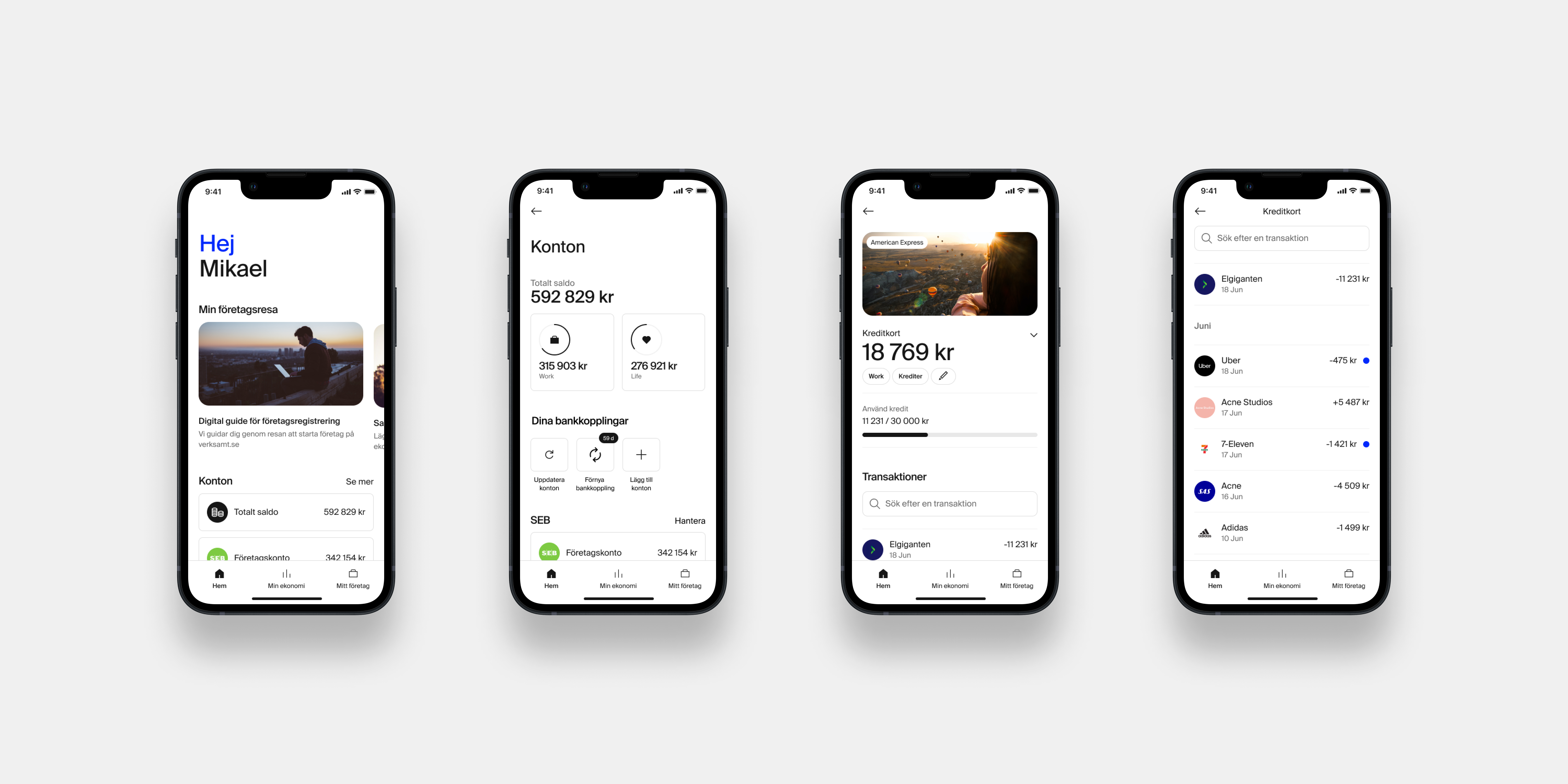
Similarly to the transactions, the list of connected external bank accounts needed to move into a sub page to improve usability. It was discovered in research that it wasn’t entirely clear how to and why users needed to update bank connections regularly (this is a must because the connections expire for legal reasons every 90 days). The need for updating the accounts was clarified by adding a UI tag with a counter to a renewal button. Furthermore, each connected account was expanded with a detailed page that contains a list of transactions for that account, which is the standard in other bank apps. The flow in the image and video shows navigation from the home screen to a credit card account and its transactions.
Components
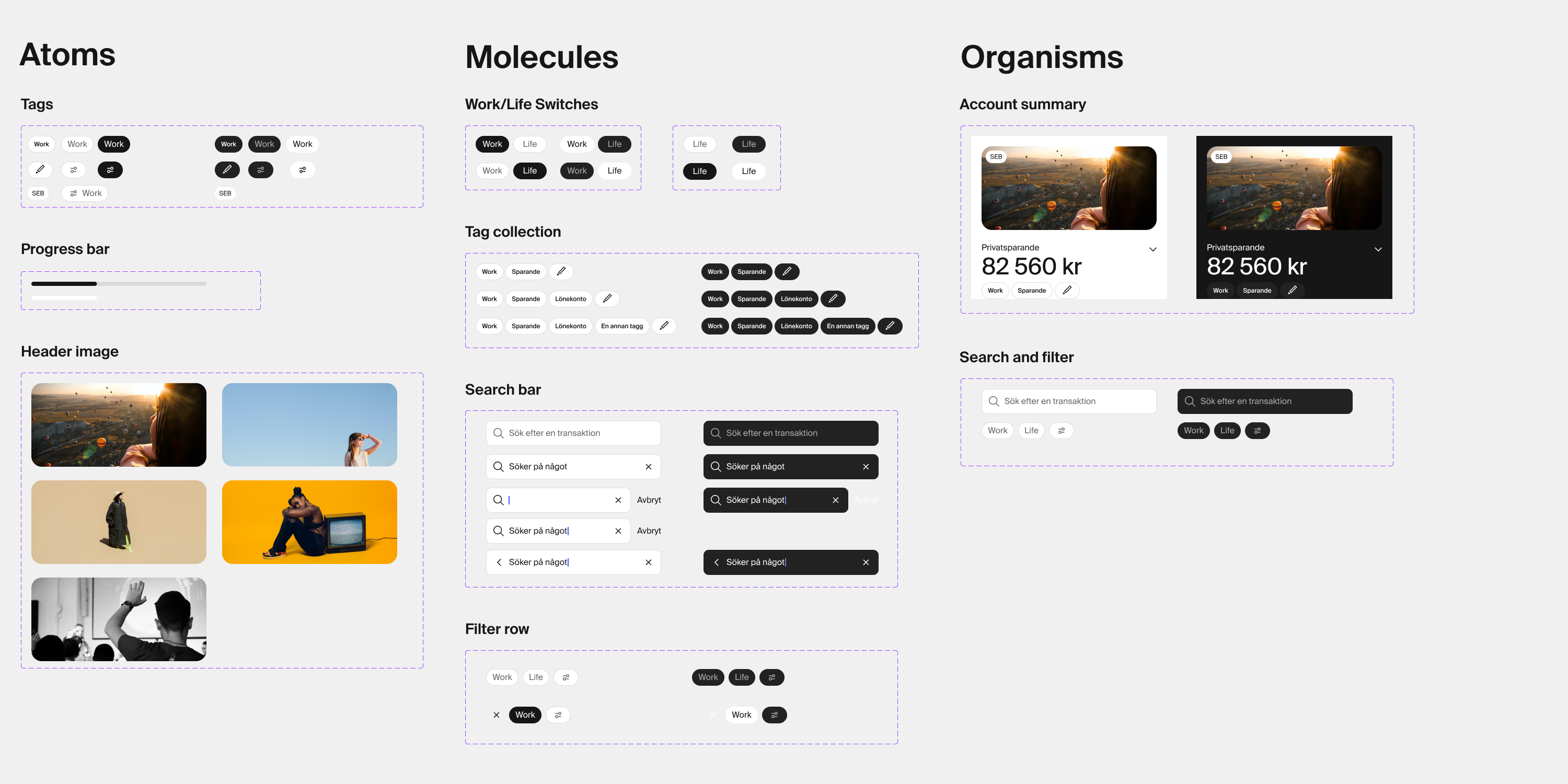
The image shows some of the designed UI components, for both light and dark mode, that were used in both the transactions and accounts designs. These are part of the atomic design system that I built throughout my time at SEBx.
Start your business
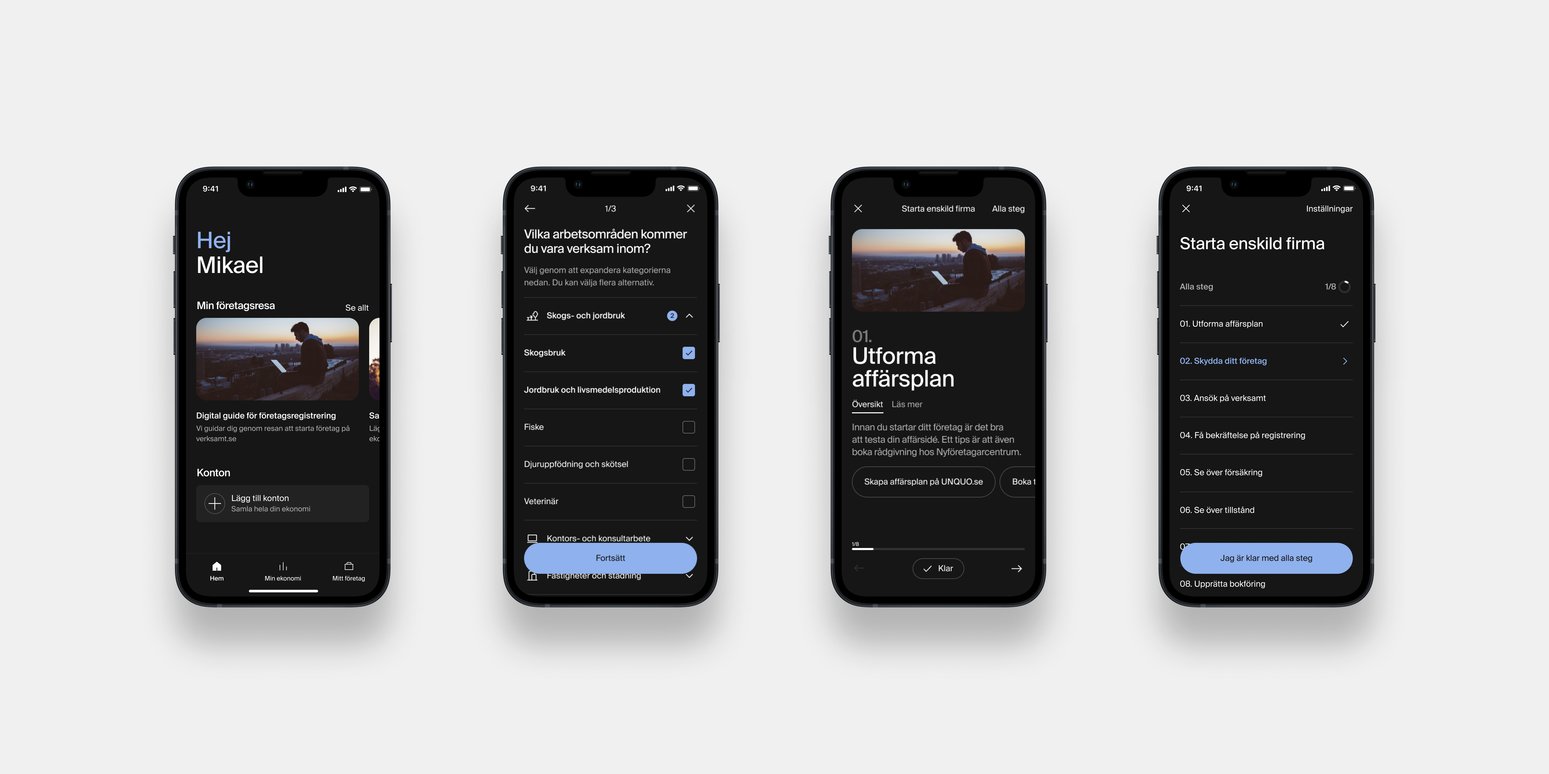
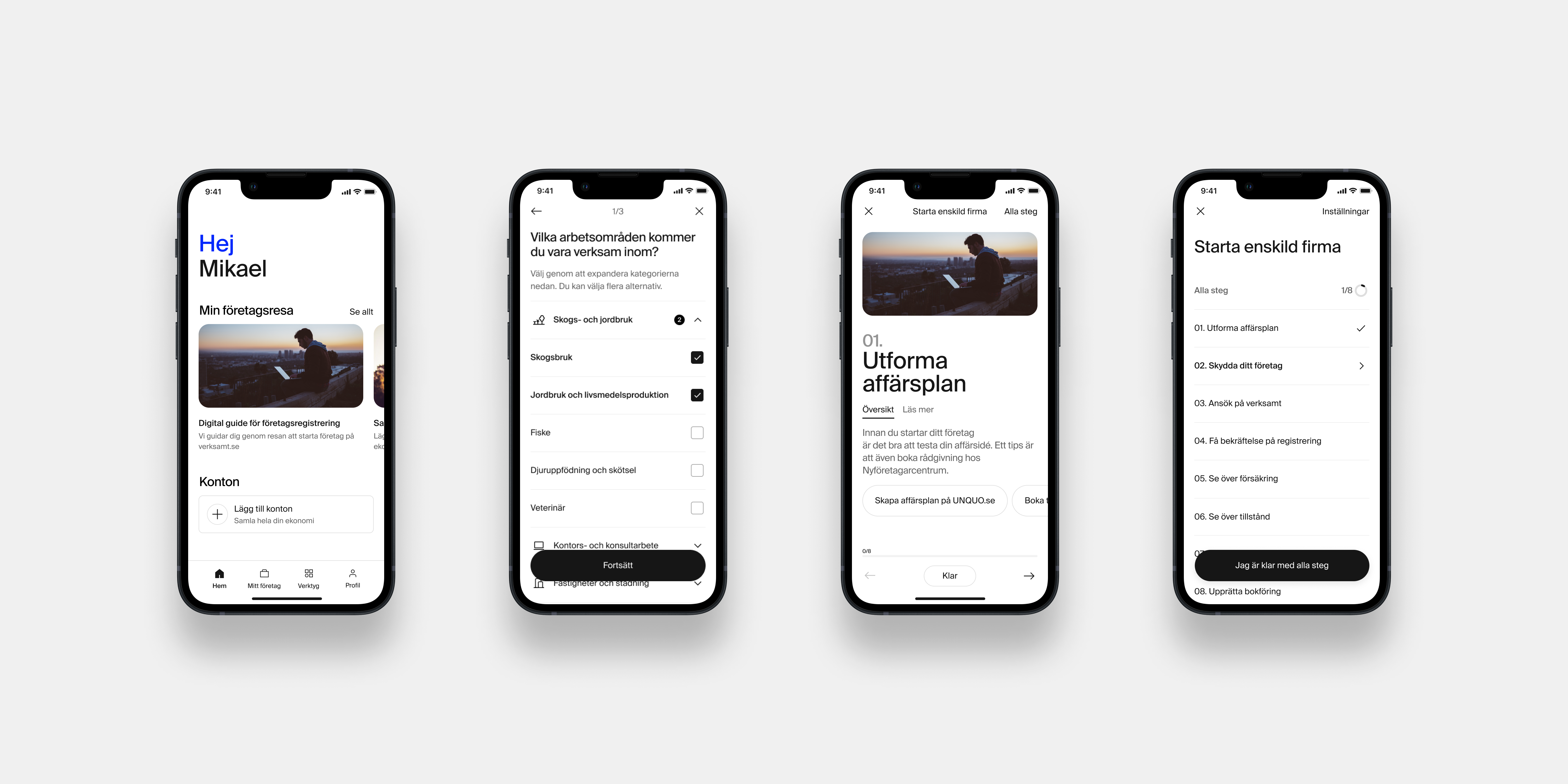
I discovered during research and in dialogues with a nationwide startup support organization that the threshold to starting a business was very high. Therefore I realized a feature to help support users in this critical journey where many touch points are difficult to understand through government bureaucracy and complicated set of rules. The feature is a checklist with steps for different company types, guiding users through steps in starting and getting up to speed with their company, including among other, creating a business plan, naming and protecting their companies, registering their companies, rules around VAT and taxes, an overview around bookkeeping etc.
The feature was initially wireframed and tested with other concepts in a qualitative evaluation with 7 users that recently had gone through the process of starting their business. The users thoughts and feelings were recorded and this feature performed the best in the initial evaluation. I led continued wireframing, research for all content, and later detailed and visual design of the complete feature, including qualitative evaluations and usability evaluations throughout the process.